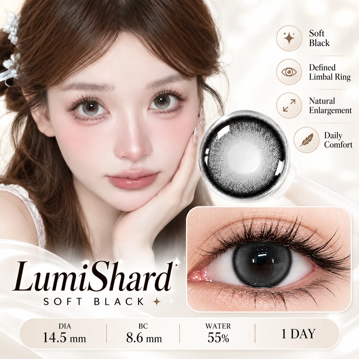
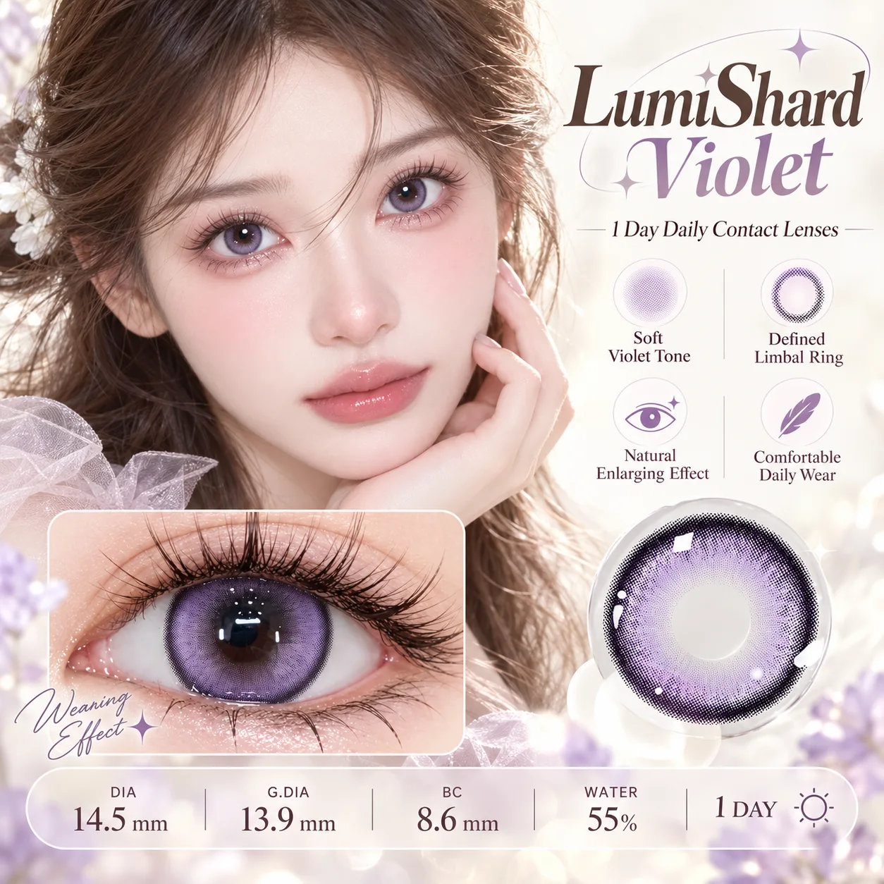
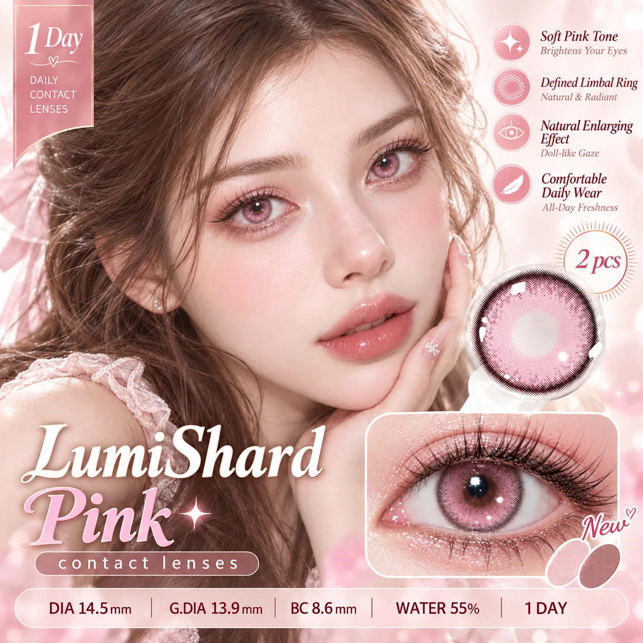
Start with undertone, not shade
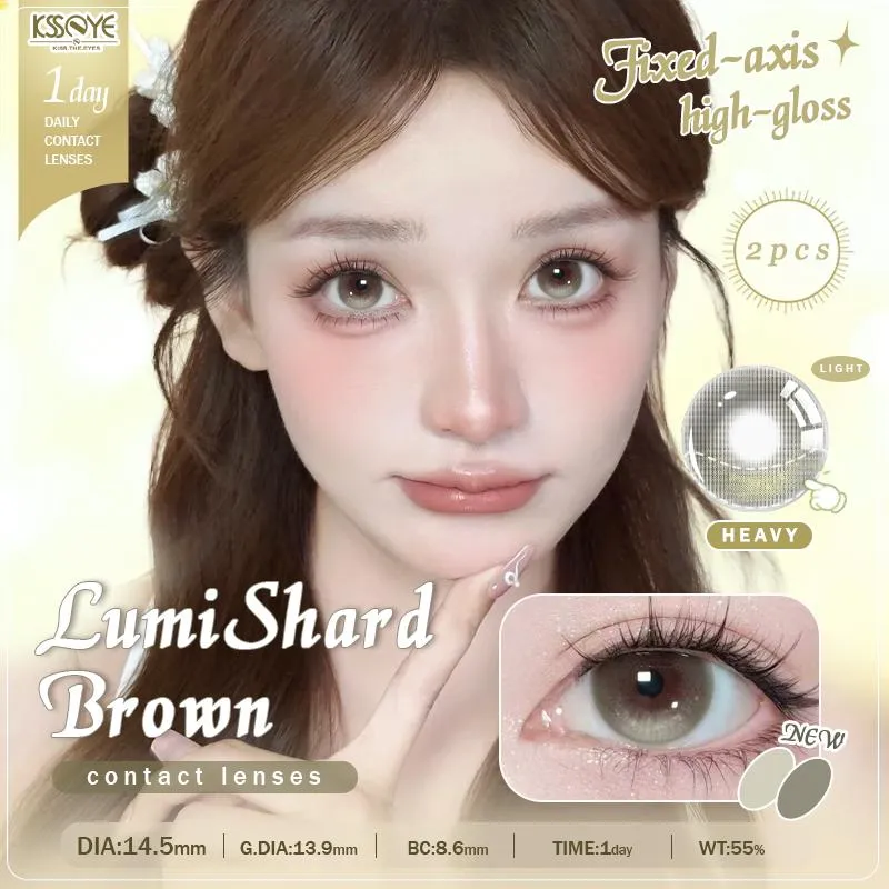
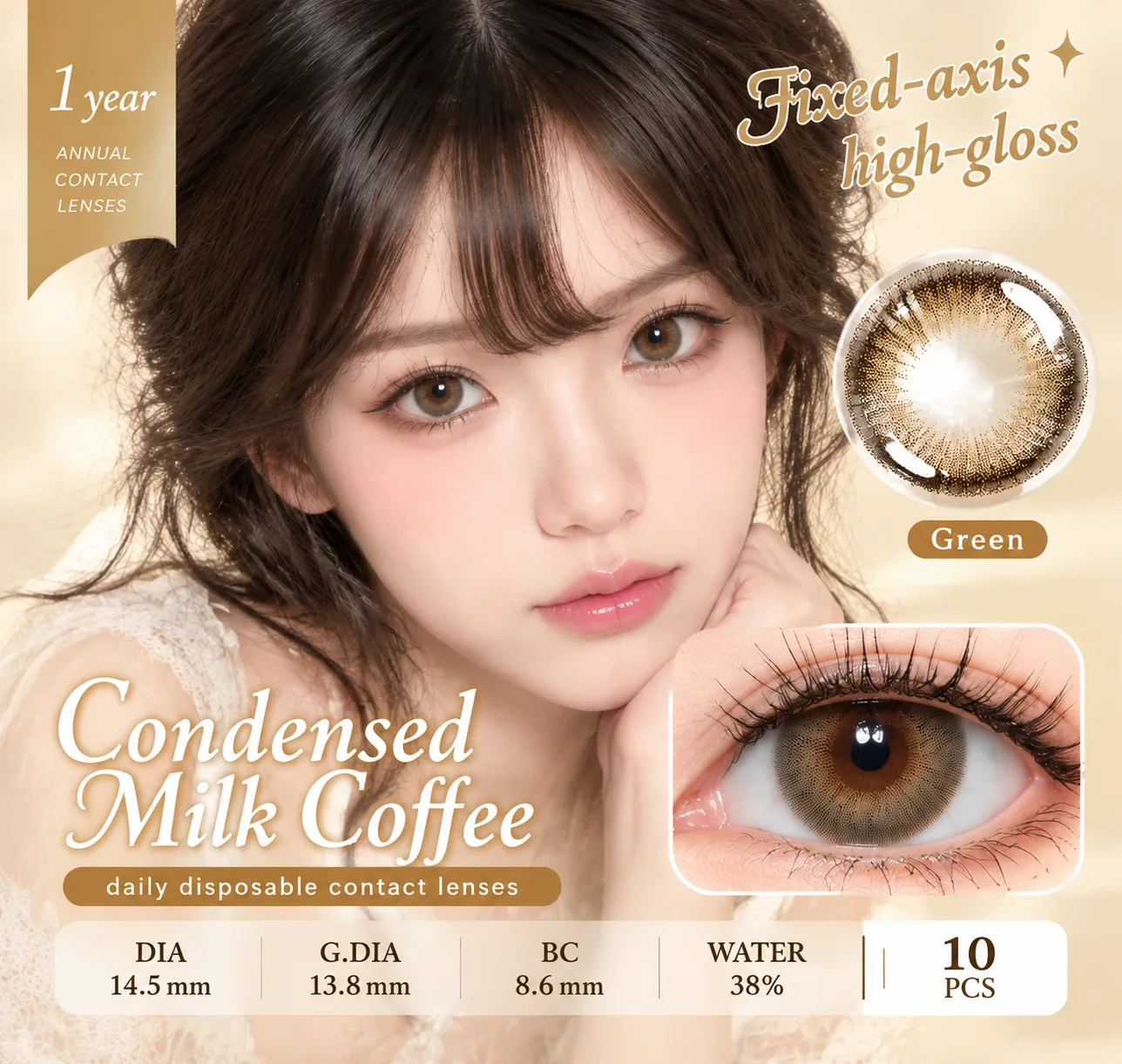
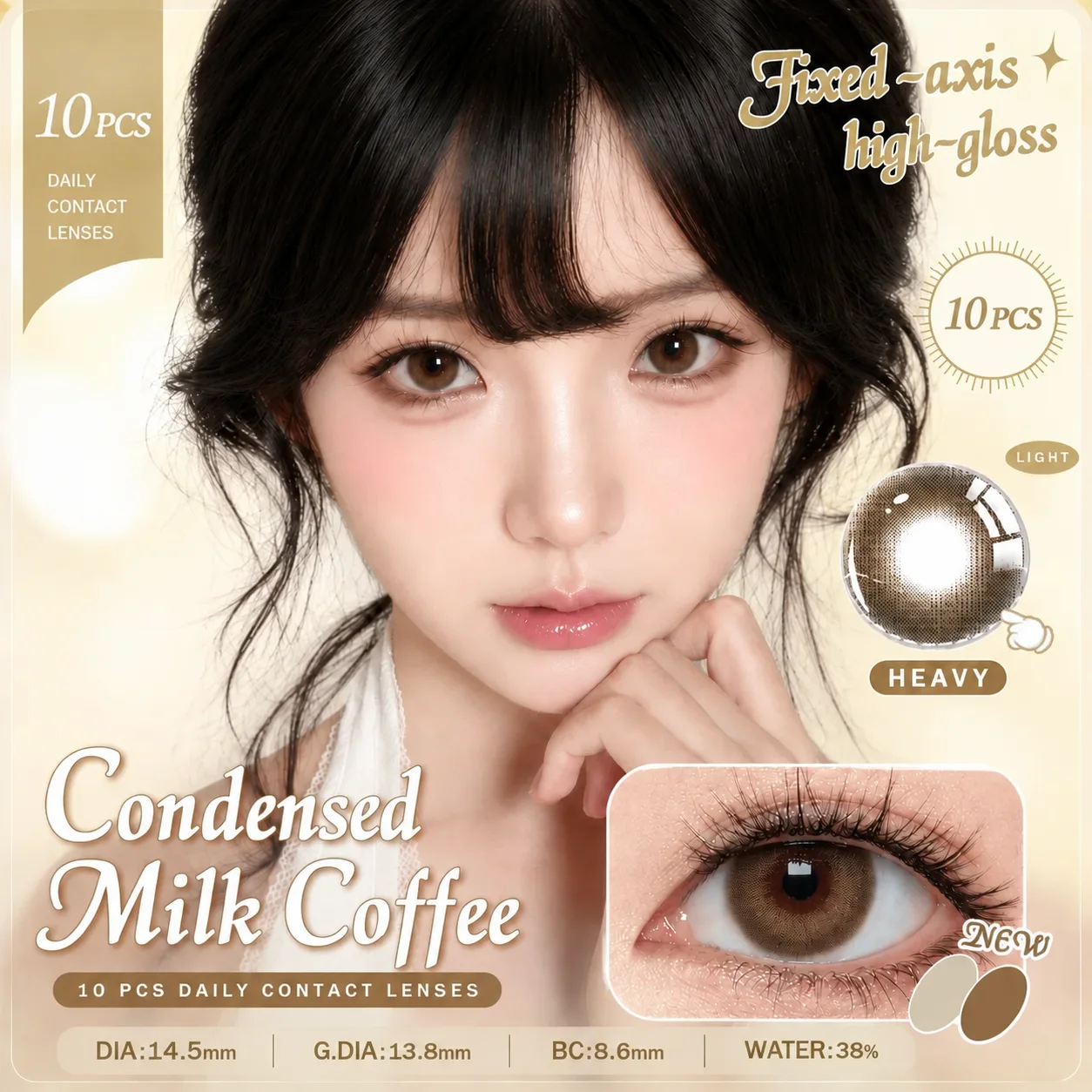
Warm undertones (golden, peachy, olive) sit comfortably with amber, honey brown, warm hazel and olive green. Cool undertones (pink, bluish, ashy) suit grey, taupe, cool brown and slate blue. Neutral skin can wear most shades but rarely needs high saturation.
Contrast matters more than colour
If your skin, hair and eyes are all soft and low-contrast, a very dark or saturated lens looks artificial. Match the lens to your existing contrast level: low contrast pairs with softer, translucent designs.
Your natural iris sets the limit
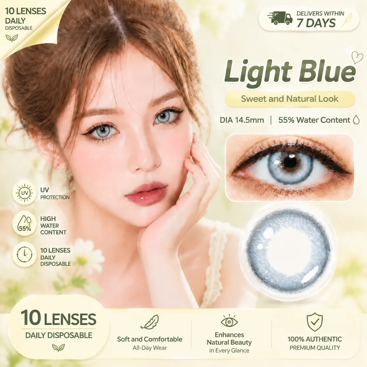
A dark brown iris will show a blue lens as a ring of colour around a dark centre. That can look striking or unnatural depending on the graphic diameter. Smaller printed areas blend more; larger ones cover the whole iris.
The daylight test
Judge a lens in indirect daylight near a window, not in a bathroom mirror. Indoor lighting is warmer and makes every shade look softer than it is.
Three reliable starting points
Warm skin: honey brown with a soft limbal ring. Cool skin: grey-brown or taupe. Neutral: hazel with a slight amber centre. These three read as natural on most people before any adjustment.
Frequently Asked Questions
Can I wear any colour if my skin is neutral?
Mostly yes, but keep saturation low. Very blue or very green lenses still need a matching contrast level.
Do coloured contacts look fake on dark skin?
Not if the graphic diameter is close to your iris width and the colour has warmth. High-contrast icy shades are the ones that look artificial.
Should I match my hair colour?
It helps. Warm hair colours tolerate warmer lenses; ash and cool hair colours pair better with grey and taupe.